Avatar
Overview
Avatars represent a person, user, or entity in the interface. They help users quickly identify context or ownership at a glance.
Sandbox
Anatomy
- Container — The circular surface that holds the avatar content.
- Image — A photo of the person or entity, displayed when available.
- Initials fallback — Two-letter initials shown when no image is present.
- Icon fallback — A generic person icon used when no image or initials are available.
Variants
User avatar
A perfect circle used to represent a person — a staff member, clinician, or logged-in user. The circular shape is a conventional signal for a human identity. Use this anywhere the subject is a person.
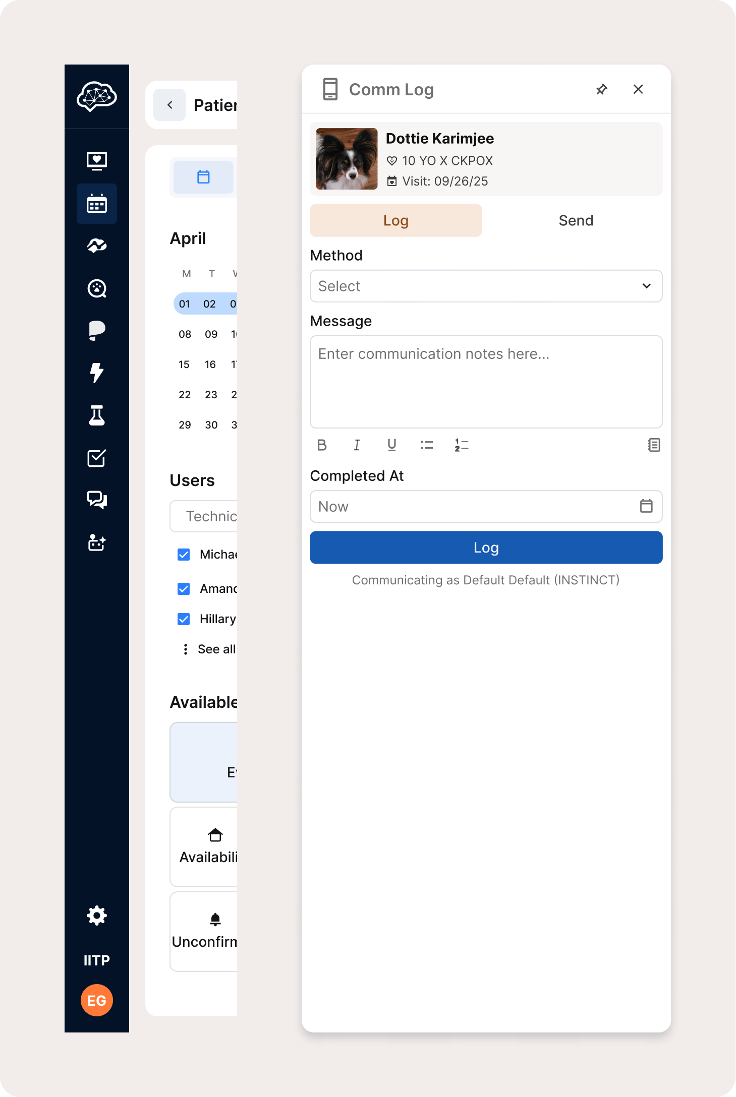
Patient avatar
A rounded square used to represent an animal patient. The shape distinction separates patients from people at a glance, which matters in screens where both types of identity appear together. Used in places like the communication log sidebar when scheduling or viewing appointments.
Usage
Avatars appear where the interface needs to communicate identity or ownership quickly.
- In the primary sidebar, the avatar sits at the bottom and belongs to the logged-in user. Clicking it opens a flyout with profile settings and account actions.
- In patient or entity cards, avatars identify the person associated with a record, such as a patient in a communication or activity pane.
Don't use avatars as decorative elements or for non-identity imagery.
Best Practices
| Do | Don't |
|---|---|
| Use avatars for quick visual identification of a person or entity | Don't use avatars for decorative or non-identity imagery |
| Use the defined 1:1 ratio across all sizes | Don't introduce arbitrary sizing or spacing |
| Provide a clear fallback — initials or the generic icon — when no image is available | Don't leave an avatar empty or broken when an image fails to load |
Accessibility
-
Provide text alternatives (alt text or aria-label) describing the represented person or entity.
-
Ensure sufficient color contrast between background and any overlaid initials or symbols.
-
Maintain a visible focus indicator for avatars that are interactive (e.g., open a menu).
-
Support keyboard navigation—avatars that trigger menus or actions must be reachable and operable via keyboard.)
-
When showing initials, ensure they are programmatically determinable for assistive tech (e.g., ).
aria-label="Michael Lund"